All posts by jrising

Integrated Food System Speed Talk

Below is my Prezi presentation, from a 4 minute “speed talk” on my research a week ago:

The main points of the narrative are below:

  1. Frame 1: My pre-thesis research:
    • I’m going to give a brief sense of where my research has gone, and my hopes for where it’s going.
    • My research has evolved– or wandered– but I’ve realized that it centers around food.
    • Food represents some of the most important ways humanity both relies upon and impacts the planet.
    • We need better models to understand this relationship– models that are sensitive to changing environmental conditions (including climate), and changing management (including adaptation).
  2. Frame 2: My thesis:
    • Perhaps more importantly, we need models powerful enough to capture feedbacks.
    • Harvests feedback and affect the harvesters: Fluctuations in a harvest affect producers in immediate and long-term ways.
    • Producers aren’t mechanical or linear: they respond dynamically to conditions.
    • Producers are part of the system, and I’m interested in understanding these systems as wholes.
  3. Frame 3: The greater whole:
    • These feedback loops are part of a larger integrated system of how food works.
    • Example: When farmers use excessive inputs in the course of their management, it impacts the environment, including that of fishers.
    • Example: 1/3 of fish caught is sold as fishmeal, which goes to feed livestock. These are all connected.
  4. Frame 4: What we eat becomes a driving force throughout this integrated system.
  5. Frame 5: A call for help:
    • Consumption patterns feed back on the production system, which feeds back on large environmental processes like climate change.
    • We need integrated models with all these parts to understand the whole and find leverage points where policies can make a difference.
    • I’d like to invite people from many fields to help out: biologists, computer scientists, economists, and foodies too.
    • Help me better represent the vast opportunities the food system holds for a sustainable future.

The Distribution of Possible Climates

There’s a lot we don’t know about future climates. Despite continuous improvements, our models still do notoriously poorly with some fairly fundamental dynamics: ocean energy transport, the Indian monsoon, and just reproducing past climate. Worse, we have the computing resources to run each model a hand-full of times. We haven’t estimated the distribution of possible temperatures that even one model predicts.

Instead, we treat the range of models as a kind of distribution over beliefs. This is useful, but a poor approximation to an actual distribution. For one, most of the models are incestuously related. Climate is chaotic, no matter how you model it, so changing the inputs within measurement error can produce a whole range of future temperatures.

This is all motivation for a big innovation from the Risky Business report, on the part of Bob Kopp and DJ Rasmussen.

First, they collected the full range of 44 CMIP5 models (downscaled and adjusted to predict every US county). They extracted each one’s global 2080-2099 temperature prediction.

Then they ran an *hemisphere* scale model (MAGICC), for which its possible to compute enough runs to produce a whole distribution of future temperatures.

Here’s the result: a matching between models and the temperatures distribution for end-of-century global temperatures.

magicc-cmip5

[From American Climate Prospectus, Technical Appendix I: Physical Climate Projections]

The opaque maps are each the output of a different GCM. The ghosted maps aren’t– at least, not alone. In fact, every ghosted map represents a portion of the probability distribution which is currently missing from our models.

To fix this, they made “surrogate” models, by decomposing existing GCM outputs into “forced” seasonal patterns which scale with temperature, and unforced variability. Then they scaled up the forced pattern, added back in the variability, and bingo! A new surrogate model.

Surrogates can’t tell us the true horrors of a high-temperature world, but without them we’d be navigating without a tail.

Tweets and Emotions

This animation is dedicated to my advisor Upmanu Lall, who’s been so supportive of all my many projects, including this one! Prabhat Barnwal and I have been studying the effects of Hurricane Sandy on the New York area through the lens of twitter emotions, ever since we propitiously began collecting tweets a week before the storm emerged (see the working paper).

The animation shows every geolocated tweet in between October 20 and November 5, across much of the Northeastern seaboard– about 2 million tweets in total.

Each tweet is colored based on our term-usage analysis of its emotional content. The hue reflects happiness, varying from green (happy) to red (sad), greyer colors reflect a lack of authority, and darker colors reflect a lack of engagement. The hurricane, as a red circle, jutters through the bottom-left of the screen the night of Oct. 29.

The first thing to notice is how much more tweeting activity there is near the hurricane and the election. Look at the difference between seconds 22 (midnight on Oct. 25) and 40 (midnight on Oct. 30).

The night of the hurricane, the tweets edge toward pastel as people get excited. The green glow near NYC that each night finishes with becomes brighter, but the next morning the whole region turns red as people survey the disaster.

Make your own Espresso Buzzer

My girlfriend uses a “Moka Express”-style stovetop Bialetti espresso-maker most mornings for her cappuccino. These devices are wonderful, reliable, and simple, but they have a nearly fatal flaw. A basin collects the espresso as it condenses, and for the five minutes before the steam brewing happens, there will be no indication of anything happening. Then espresso will start to quietly gurgle up, and if you don’t stop the process in the 20 seconds after it starts, the drink will be ruined.

I built a simple device to solve this problem. It has two wires that sit in the basin, and a loud buzzer that sounds as soon as coffee touches them.

setup1

How it works

Here is the circuit diagram for the coffee buzzer, designed to be powered by a 9V battery:

detector

The core of the coffee buzzer is a simple voltage divider. Normally, when the device is not in coffee, the resistance through the air between the two leads on the left (labeled “LOAD”) is very high. As a result, the entire voltage from 9V battery is applied to that gap, so that the voltage across the 500 KΩ resistor is 0.

The IRF1104 is a simple MOSFET, which acts like a voltage-controlled switch. With no voltage across the resistor, the MOSFET is off, so the buzzer doesn’t sound.

To turn the MOSFET on, the voltage across the 500 KΩ resistor needs to be about 2 V. As a result, anything between the two LOAD leads with a resistance of less than about 2000 KΩ will cause the buzzer to turn on.

resistance

Coffee resistance seems to vary quite a bit, and the 137 KΩ shown here is on the low end. For this, you need a resistor of at least 40 KΩ. I suggest using something higher, so the detector will be more sensitive.

What you need

Tools

You will need wire-strippers, a multimeter (to check your circuit), and a soldering iron (to put everything together).

strippers multimeter solder

Parts

wire2

These wires will be the main detector of the coffee buzzer.

resistor

Here I use a 1500 KΩ resistor, so the buzzer will sound for resistances less than 5000 KΩ will be detected. Make sure that you use a resistor of more than 300 KΩ.

mosfet

The MOSFET is a voltage controlled switch, and it’s what allows the buzzer to get plenty of current even though there’s a lot of resistance for current moving through the coffee.

connector buzzers battery

You can get a 9V battery connector (top) and a buzzer (middle, rated for between 4 and 8 V) at RadioShack or from DigiKey. And, of course, the battery itself (not included).

Optional (but highly recommended!)

switch

A simple switch (which may look very different from this one) is a great way to build an integrity tester into the device itself.

breadboard

A breadboard will let you put the whole circuit together and test it before you solder it.

wires

Wires like these make plugging everything into a breadboard easier.

tape

I suggest taping up the whole device after you solder it, both for protection and to keep everything in one tight package.

How to make an Espresso Buzzer

Start by preparing the detector wires (the black and white wires above). Take at least 30 cm of wire, so the device can sit on the counter away from the flame. Use the wire stripper to strip one end of the wires for use in the circuit. You may want to strip the “detection” end, or not: if you leave the detector end unstripped, the buzzer won’t go off prematurely when if both wires touch the bottom of the basin, but you’ll have to wipe off the end of the wires to get them to stop buzzing once they have started.

Now connect all of the pieces on the breadboard. Here’s one arrangement:

circuit-annotated

If you aren’t sure how to use a breadboard or how to read a circuit diagram, you can still make the buzzer by skipping this step and soldering the wires together as specified below.

Once everything is connected on the breadboard, you should be able to test the coffee buzzer. If you use a switch, pressing it should make the buzzer sound. Then make a little experimental coffee, and dip the leads into the coffee to check that it works.

Next, solder it all together. As you can see in the circuit diagram, you want to solder together the following groups of wires:

  • Ground: The black wire from the battery connector; one wire from the resistor; and the source lead on the MOSFET (furthest right).
  • Power: The red wire from the battery connector; one wire from the buzzer; the (stripped) circuit end of one of the detector wires; and optionally one end of the switch.
  • Gate: The (stripped) circuit end of the other detector wire; the other end of the resistor; the gate lead on the MOSFET (furthest left); and optionally the other end of the switch.
  • Buzzer: The gate lead on the MOSFET (middle); and the remaining wire to the buzzer.

soldered

After you have soldered everything together, test it and then wrap tape around it all.

complete

The results

That’s it! Now, to use it, place the detector leads at the bottom of the coffee basin. I suggest putting a bend into the wires a couple inches from the end, so they can sit easily in the basin. If you’ve stripped the ends, the buzzer may buzz when the leads touch the base, but if you just let them go at this point, one wire will sit slightly above the other and just millimeters away from the bottom for perfect detection.

setup2

As soon as the coffee reaches a level where both leads are submerged, the detector will start buzzing!

final1

Enjoy!

final2

The Fear of ISIS

I don’t understand how ISIS has instilled so much fear in so many people. ISIS is not a danger to us– at least, compared to anything from heart disease to climate change-induced hurricanes. Is there a word for recognizing a danger, but choosing not to dwell on it?

Even in the sphere of international relations (and outside of environmental governance), I think there are far more important things to be concerned about. Russia’s invasion of Ukraine, and its implications, for example.

The narrative around ISIS seems to have everyone believing that military action is imperative. I don’t know if there’s a “solution” to ISIS, but I think that military action against terrorist groups needs to be very carefully tempered with non-military relation-building.

Jeff Sachs wrote a recent op-ed on the use of military in the Middle East, titled “Let the Middle East Govern Itself”. The message is,

The US cannot stop the spiral of violence in the Middle East. The damage in Libya, Gaza, Syria, and Iraq demands that a political solution be found within the region, not imposed from the outside. The UN Security Council should provide an international framework in which the major powers pull back, lift crippling economic sanctions, and abide by political agreements reached by the region’s own governments and factions.

Military action has not worked in the past. Why do we turn to it when we have nothing to fear?

Simple Robust Standard Errors Library for R

R doesn’t have a built-in method for calculating heteroskedastically-robust and clustered standard errors. Since this is a common need for us, I’ve put together a little library to provide these functions.

Download the library.

The file contains three functions:

  • get.coef.robust: Calculate heteroskedastically-robust standard errors
  • get.coef.clust: Calculate clustered standard errors
  • get.conf.clust: Calculate confidence intervals for clustered standard errors

The arguments for the functions are below, and then an example is at the end.

get.coef.robust(mod, var=c(), estimator=”HC”)
Calculate heteroskedastically-robust standard errors

mod: the result of a call to lm()
     e.g., lm(satell ~ width + factor(color))
var: a list of indexes to extract only certain coefficients (default: all)
     e.g., 1:2 [to drop FE from above]
estimator: an estimator type passed to vcovHC (default: White's estimator)
Returns an object of type coeftest, with estimate, std. err, t and p values

get.coef.clust(mod, cluster, var=c())
Calculate clustered standard errors

mod: the result of a call to lm()
     e.g., lm(satell ~ width + factor(color))
cluster: a cluster variable, with a length equal to the observation count
     e.g., color
var: a list of indexes to extract only certain coefficients (default: all)
     e.g., 1:2 [to drop FE from above]
Returns an object of type coeftest, with estimate, std. err, t and p values

get.conf.clust(mod, cluster, xx, alpha, var=c())
Calculate confidence intervals for clustered standard errors

mod: the result of a call to lm()
     e.g., lm(satell ~ width + factor(color))
cluster: a cluster variable, with a length equal to the observation count
     e.g., color
xx: new values for each of the variables (only needs to be as long as 'var')
     e.g., seq(0, 50, length.out=100)
alpha: the level of confidence, as an error rate
     e.g., .05 [for 95% confidence intervals]
var: a list of indexes to extract only certain coefficients (default: all)
     e.g., 1:2 [to drop FE from above]
Returns a data.frame of yhat, lo, and hi

Example in Stata and R

The following example compare the results from Stata and R for an example from section 3.3.2 of “An Introduction to Categorical Data Analysis” by Alan Agresti. The data describes 173 female horseshoe crabs, and the number of male “satellites” that live near them.

Download the data as a CSV file. The columns are the crabs color (2-5), spine condition (1-3), carapace width (cm), number of satellite crabs, and weight (kg).

The code below calculates a simple model with crab color fixed-effects, relating width (which is thought to be an explanatory variable) and number of satellites. The first model is a straight OLS regression; then we add robust errors, and finally crab color clustered errors.

The analysis in Stata.

First, let’s do the analysis in Stata, to make sure that we can reproduce it in R.

import delim data.csv

xi: reg satell width i.color
xi: reg satell width i.color, vce(hc2)
xi: reg satell width i.color, vce(cluster color)

Here are excerpts of the results.

The OLS model:

------------------------------------------------------------------------------
      satell |      Coef.   Std. Err.      t    P>|t|     [95% Conf. Interval]
-------------+----------------------------------------------------------------
       width |   .4633951   .1117381     4.15   0.000     .2428033    .6839868
       _cons |  -8.412887   3.133074    -2.69   0.008    -14.59816   -2.227618
------------------------------------------------------------------------------

The robust errors:

------------------------------------------------------------------------------
             |             Robust HC2
      satell |      Coef.   Std. Err.      t    P>|t|     [95% Conf. Interval]
-------------+----------------------------------------------------------------
       width |   .4633951   .1028225     4.51   0.000     .2604045    .6663856
       _cons |  -8.412887   2.939015    -2.86   0.005    -14.21505   -2.610726
------------------------------------------------------------------------------

Note that we’ve used HC2 robust errors, to provide a direct comparison with the R results.

The clustered errors.

------------------------------------------------------------------------------
             |               Robust
      satell |      Coef.   Std. Err.      t    P>|t|     [95% Conf. Interval]
-------------+----------------------------------------------------------------
       width |   .4633951   .0466564     9.93   0.002     .3149135    .6118767
       _cons |  -8.412887   1.258169    -6.69   0.007    -12.41694   -4.408833
------------------------------------------------------------------------------

The robust and clustered errors are a little tighter for this example.

The analysis in R.

Here’s the equivalent code in R.

source("tools_reg.R")
tbl <- read.csv("data.csv")

mod <- lm(satell ~ width + factor(color), data=tbl)

summary(mod)
get.coef.robust(mod, estimator="HC2")
get.coef.clust(mod, tbl$color)

And excerpts of the results. The OLS model:

               Estimate Std. Error t value Pr(>|t|)    
(Intercept)     -8.4129     3.1331  -2.685  0.00798 ** 
width            0.4634     0.1117   4.147 5.33e-05 ***

The coefficient estimates will be the same for all three models. Stata gives us -8.412887 + .4633951 w and R gives us -8.4129 + 0.4634 w. These are identical, but with different reporting precision, as are the standard errors.

The robust errors:

(Intercept)    -8.41289    2.93902 -2.8625  0.004739 ** 
width           0.46340    0.10282  4.5067 1.229e-05 ***

Again, we use HC2 robust errors. Stata provides 2.939015 and .1028225 for the errors, matching these exactly.

The clustered errors:

                Estimate Std. Error  t value  Pr(>|t|)    
(Intercept)    -8.412887   1.258169  -6.6866 3.235e-10 ***
width           0.463395   0.046656   9.9321 < 2.2e-16 ***

Stata gives the exact same values as R.
Top 500: Historical overfishing and the recent collapse of coastal ecosystems

I’ve started a long project of identifying my top 500 articles and chapters– the papers that either had a great impact on me or that I keep returning to to illustrate a point. One of those is Jeremey Jackson et al. (2001), Historical overfishing and the recent collapse of coastal ecosystems.

The main argument– that overfishing precedes, predicts, and predisposes the present fragility of ecosystems to modern drivers like pollution– is less interesting than the case studies themselves: kelp forests, coral reefs, seagrass beds, oyster estuaries, and benthic communities. This before-after diagram drives the point home (I colored the changes):

overfishing

The most depressing line is in the abstract:

Paleoecological, archaeological, and historical data show that time lags of decades to centuries occurred between the onset of overfishing and consequent changes in ecological communities, because unfished species of similar trophic level assumed the ecological roles of overfished species until they too were overfished or died of epidemic diseases related to overcrowding.

Resolving a Hurricane of Questions

Maybe questions of social science never get truly resolved. The first year of my PhD, I remember John Mutter describing the question of creative destruction. Sometimes, the story goes, a disaster can lead to an unexpected silver lining. By destroying outdated infrastructure, or motiving people to work together, or driving a needed influx of aid, a disaster can eventually leave a community better off than beforehand. Mutter described it almost like a philosophical quandary. In the face of all the specifics of institutions, internal perceptions, and international relations, how will we ever know?

For years now, Solomon Hsiang has been producing insights from his LICRICE model, turning hurricanes into exogenous predictors. As these random shocks echo through societies, he’s been picking up everything that falls out. I got to listen to some of it when news reporters would call his office. His work with Jesse Anttila-Hughes turned up the true mortality threat of disasters, typically 10x the lives lost at the time of the event. Jesse dug further, finding how family assets changed, how meals were redistributed, and how young girls are often the most hurt, even those born after the disaster.

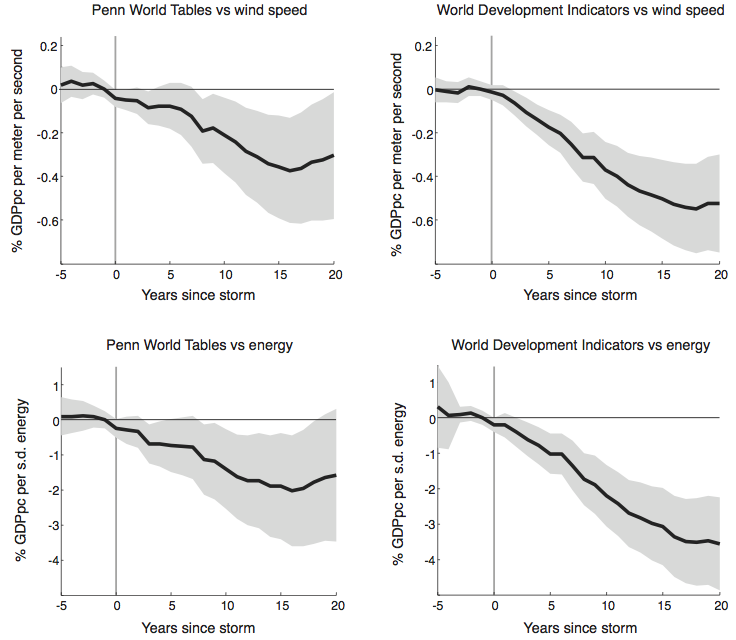
Last month, Sol and Amir Jina produced an NBER working paper that steps back from the individual lives affected. Their result is that a single storm produces losses that continue to accumulate for 20 years. People are not only continuing to feel the effects of a hurricane 20 years down the road, but they additional poverty they feel at 10 years is only half of the poverty that they’ll feel in another 10.

hurricanes

Of course, this is an average effect, and an average of 6415 different country results. But that means that for every country that experiences no long-term effect, one experiences twice the poverty.

So, is there creative destruction? It’s very, very unlikely. The most likely situation is “no recovery”: countries will never return to the trend that they were on prior to the event. Things are even more dire under climate change,

For a sense of scale, our estimates suggest that under the “Business as usual” scenario (with a 5% discount rate) the [present discounted value] of lost long-run growth is $855 billion for the United States (5.9% of current GDP), $299 billion for the Philippines (83.3% of current GDP), $1 trillion for South Korea (73% of current GDP), $1.4 trillion for China (12.6% of current GDP), and $4.5 trillion for Japan (101.5% of current GDP).

That’s what we should be willing to pay to avoid these costs. In comparison to the $9.7 trillion that just additional hurricanes are expected to cost, the $2 trillion that Nordhaus (2008) estimates for the cost of a climate policy seems trivial. That’s two big, seemingly unanswerable questions as settled as things get in social science.

Classes Diagram

Sometimes a diagram helps me find order in chaos, and sometimes it’s just a way to stroke my ego. I was recently trying to make sense of my graduate school classes, even as they’re becoming a less and less important share of my gradschool learning. So, I added to a diagram I’d made ten years ago for college.  In the end, I’m not sure which purpose it serves more.

classes

The diagram is arrayed by discipline and year. The disciplines are arranged like a color wheel (and classes colored accordingly), from theoretical math, through progressively more applied sciences, through engineering and out the other end into applied humanities (like music), and finally back to theoretical philosophy. Arrows give a sense of thematic and prerequisite relationships.

Economics, a core of the Sustainable Development program, probably sits around the back-side of the spectrum, between philosophy and math. I squeezed it in on the left, more as a reflection of how I’ve approached it than what it tried to teach.

This is also missing everything I’ve learned from classes I’ve taught. I wish there were a place for Progressive Alternatives from two years ago, or Complexity Science from last year. I guess I need another diagram.