Yoinked from siderea:
Backup my hypnotism regularly.
Take
Volunteer to spend time with politics.
Apply for a new parecon.
Ask my boss for a chocolate.
I’m still trying to figure out how it knew about my secret fear.
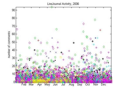
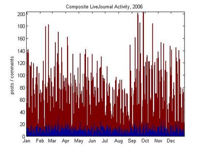
And here’s an LJ toy of my own. Below is the graph of the total livejournal activity of my friends over the past year. On the left, each point represents someone’s [public] post, with the height being the number of comments. The right shows a bar for every day: blue is posts, red is comments.

|

|
I’m really curious about the bar graph: the post counts vary by day of week but are fairly constant over time, but the comment counts seem to come in long waves (must do longer-timespan analysis!). I built the toy to possibly do some nifty word frequency analysis or subject vs. comment count comparisons– but I’ll do that later. If you want a graph of your own, or have other fun ideas of extensions for this analyzer, just comment below.